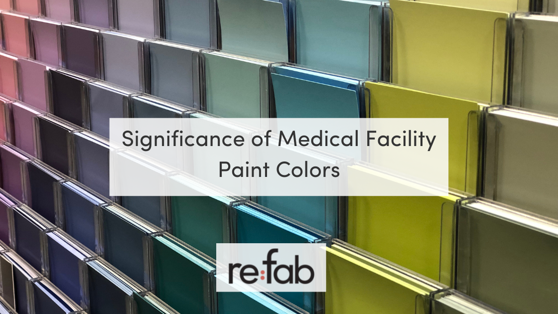
Colors do much more than simply amuse people. They are stimulants for the mind and help set up a healing ambiance for patients. Many buildings use a smart combination of wall colors to attract and amaze visitors. Based on their color selection, people are subjected to all sorts of feelings. Thus the idea of using paint colors in a healthcare facility setting does not seem too farfetched. Medical Facility Paint Colors help foster feelings of positivity and provide encouragement to the patients. This helps them recover fast and feel more at ease while doing so.
It is only natural for people to be stressed out when they visit the doctor, but a bright and lively display is sure to lift their spirits.
But how does that happen, and which colors are good for doing so? We will answer these and several other important color-related questions in this article, so hang tight as we explore why paint colors are important in a medical facility.
Paint Colors Affect People’s Minds
We know that colors do have a psychological effect. Whether one accredits it to arbitrarily defined social constructs or other associations, the ground realities don’t change: colors affect people. They bring joy, sorrow, peace, calmness, alertness, and all sorts of behavioral changes.
Colors and shades directly affect our mental state, and even if we don’t feel it happening at once, they do change the way our bodies work. For instance, blue shades have demonstrated the ability to lower blood pressure, smoothen the heartbeat rate, and slow down respiration.
However, red can have the opposite effects as it boosts the adrenaline levels in a person’s body and makes them more active and alert.
The effect of colors on people’s mental and physical health is no news for anyone. Several research efforts have been directed to understand all of this. Based on the type of space you have, you’d want shades to accentuate the ambiance and create the visitors’ desired state of mind. For instance, bold colors would go nicely for a beauty salon where you wish to get people excited. Still, the same cannot be said for most areas of a hospital setting.
Medical facilities are meant to alleviate stress and pain. Thus the use of neutral and soothing colors makes more sense. But even in a hospital or clinic, there is no single solution for color selection as different wings and sections serve different functions.
But why care about the psychology of colors, and how is it relevant?
Well, as it so happens, colors can help the healing process. With a calmer mind, the patient’s body also becomes relaxed and calm. This unleashes a cascade of biochemical and physiological reactions throughout their being, especially in the brain, making them stronger against their ailment. Stress is the enemy here. Not only will it weaken a patient’s ability to fight back against a condition, but it may also give rise to new problems on its own. Thus a smart color choice is relevant in a medical setting because colors and healing are interconnected.
Basics Of Color Selection For A Hospital
Now that we know how colors can have a healing effect let’s move onto the more important segment of the discussion: choosing the perfect colors for healthcare facilities. There is no single fix for all cases. Instead, you need to read the situation and then choose accordingly.
Here are a couple of things you can do to make the selection process simpler:
Know The Room’s Purpose
If you know what type of people will occupy a space, then the color selection can be much more fruitful. All rooms within a healthcare facility serve a specific purpose. Thus your paint colors should also be compatible with the purpose they serve.
A waiting room, for instance, should not present dull and uninspiring colors, but instead be lively with a little bit of optimism reflected in the setting (reassuring posters, etc.), not shocking or overly bold, but still filled with enough positivity to make the patient feel at home.
As for residential quarters (as in nursing homes and elderly care facilities), the atmosphere should be welcoming. Shades of white, yellow, and green are some of the most widely used choices in this regard. You can even contrast them with earth tones like turquoise, blue, and so on if you wish to avoid a monotonous single-shade display. Go for bright shades but remember not to overdo it. After all, the idea is to keep adrenaline levels down and induce and sensation of calmness. Strong shades can have the opposite effect. Thus be sure to select calming and soothing ones. Professional painters can offer all the help you may need here.
The Materials & Effects Present Inside The Room Also Matter
Another important consideration for selecting the perfect paint colors is knowing how the shades will contrast against the stuff you plan on keeping inside the said areas. While small décor pieces can be moved around with ease and can replace a couple of effects, the overall ensemble will most likely remain the same. What is the color of the furniture and machines that you’ve kept inside the room?
By thinking the other way around, you can narrow down your choices of the shades by simply choosing those that fit well with the room setting. Of course, there must be complete unison for the colors to impact and no hint of conflict. Thus all the shades should contrast well and create a nice blend too. Plus, it saves time, too, because we all know how hard it is to choose between two equally good options.
Color Selection & Brand Identity
You’ve exhausted all other options, considered every single angle, explored all the color combinations possible, and still can’t seem to make a decision. While there are dozens of perfect combos, they don’t seem to speak “you,” and if that is the case, then why not find the ones that do? Not kidding, as mentioned earlier, colors help create brand identity, so why not use this principle?
Your medical facility probably has a logo with all sorts of bright and vibrant shades in it. You can pull some of those colors and apply them to the walls. This way, the colors will help create an atmosphere that perfectly reflects your brand. And all of this works out perfectly for you, too, because the calming shades will help patients subconsciously associate friendly medical services with your brand because of the color psychology. And, since these psychological reactions are involuntary, so make the best out of them!
Checklist For Color Selection In A Medical Center
Are you still feeling lost?
No worries, it happens. Go through this list of factors to consider, and hopefully, by the time you reach the end, you would’ve already made a decision:
- Consider how the lighting (both sunlight and artificial light) will affect the shade of the color.
- Align your color preference with the age group that is supposed to occupy the area.
- Use different colors for patient areas and visitor sections.
- Consider the disease types and the effects of the said disease on people’s minds before selecting a shade. In some cases, you’ll need something to lift their spirits. In other cases, you’ll have to go for something calming and soothing.
- Consider color perception problems before finalizing your decision, i.e., for color-blind patients (if your clinic caters to them).
- Contrasting colors usually work nicely but may not always be needed, especially if they can put your patients under stress (because of their condition).
- Don’t use shades and colors used by important labels and hazard signs to avoid confusion.
If, at any point, you feel lost as to which color to go for, ask the painting professionals. They’ll be glad to help you out.
We’ve covered some examples in the following sections, so be sure to check them out and see how colors can create a difference in all sorts of spaces within a healthcare building.
Color Selection For Different Areas In A Medical Center
These examples might help clear up things better:
Rooms For Housing Patients
Since patients are in pain and ever anxious to see a doctor, rooms housing them should emanate an aura of calmness and relaxation. Thus colors that calm down the mind and soul should be used here. For instance, shades of green are known to promote tranquility and positivity.
Since most people associate green with nature, it is all the more reason to use shades to make them feel at home and thus aid their healing. Similarly, blue color lowers the heartbeat rate and relaxes the body, counteracting the effects of stress-promoting factors.
Of course, these colors alone cannot do the complete job. This is why more and more clinics and hospitals have started using custom designs to accentuate these shades with meaningful themes. Nature is a recurrent element of these “biophilic designs” – more on them later – which help promote healing.
Waiting Areas
If you asked people to close their eyes and imagine a hospital waiting area, how do you expect them to describe it, in general? Probably a little tiny, overcrowded space, shaken by the noise of all that’s happening around. Unfortunately, they won’t be wrong here because this is exactly how most waiting areas are in hospitals and clinics.
It is a bit ironic, considering that this is the first section of the hospital visitors will see. You’d want it to be as excellent as possible. Expanding the area should be considered, but if that is not possible, then the least you can do is to do away with all the dull carpets and messed up furniture.
Once you’ve done that, go for comfortable eye-candy paint colors; earth tones work excellently in such settings. Something like turquoise or blue would be perfect for keeping the atmosphere calm and hopeful, the way you want it to be in a hospital.
Match the carpet and furniture accordingly, and you’ve got the perfect waiting room.
Therapy Rooms/Spaces
Patients with nervous, muscular, or skeletal conditions (and many more) often require prolonged therapy sessions with regularity to get back to their normal lives. Now imagine them doing so in a room with a complete absence of positivity.
Insufferable, right?
You can go a bit bold here because the idea is to lift the spirits and make the patients reclaim that ‘can-do’ attitude. With the surge of adrenaline, driven by colors like red on a wall, nestled among neutrally colored ones (grey, beige, etc.), your patients will have all the energy and motivation they need. Just be sure not to overdo the bold thing because you don’t want to lose the calmness factor.
Biophilic Designs Accentuate The Positivity Of Colors
As noted earlier, some healthcare facilities have kicked things up a notch and used biophilic designs to promote positivity and serenity. These nature-inspired themes make a perfect combination with brightly colored walls, especially with the shades of green.
Indoor plants, windows that open to a nice garden scene, preference of natural lighting, artwork depicting the beauty of nature, and an overall natural ambiance are all recurring elements within such designs. These not only boost the looks of the place but also promote healing. This much has been scientifically proven! Biophilia is the next step in boosting the healing potential in a medical space. Still, it all starts with a perfect color choice.
Professional Painters Can Make All the Difference in a Healthcare Setting
We’ve discussed how painters can share their insights with you and help you decide what works the best for every situation, but things go much beyond this. Commercial painters can do much more than help you with paint selection.
Here are some solid reasons for you to consider professionals over unskilled workers for your project:
- Professional painters will have experience with the specific type of project and thus be able to express their expertise more effectively.
- They will know how to extend the durability of a coat and get the best out of a color scheme.
- You can expect them to work during off-hours, according to your timetable, not their own.
- Commercial painters ensure complete uniformity and consistency in their job.
- They won’t create any disturbance or problem for you while they work.
- You will get a completely neat and tidy finish, plus the room will also be free of any marks or paint stains; perfection is guaranteed.
- Commercial painters usually do all the prep work and cleaning by themselves.
- Extra durability for paint coats applied on high-traffic areas.
- They will help you pick a paint containing minimal VOC content and thus keep the interior safe for everyone.
- Professional workers are well equipped and knowledgeable about what they are doing.
- An insurance policy also covers them.
- They will follow all the safe practices according to the PDCA standards.
re:fab Boasts Decades of Professional Excellence in The Painting Business
Painting a medical facility is not the type of project you can entrust to a non-professional. This article only discussed the importance of colors in this setting and nothing beyond that. However, we do know that there are dozens of more considerations to be aware of.
You need paint that is safe for people, stays on for a long time, gives a nice finish, and withstands the test of time. But that’s not it. Only a professional group of painters, properly equipped and well-aware of the job they’re doing, can deliver results that amaze and impress.
At re:fab, you will find a team of experts engaged in the realm of commercial painting for over three decades. We have handled all sorts of projects and delivered our best with every single one of those. Moreover, since all of our workers are licensed, insured, and completely professional, you don’t need to worry about a thing. Contact us today, and we’ll get your place ready in no time!