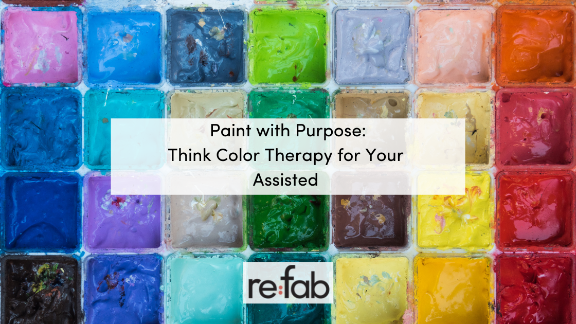
Summer and Fall are great times of the year to repaint your assisted living property, but we know deciding on the paint color can often seem overwhelming. Do you stick with the same old color palette you’ve chosen in the past –neutral, beige – or do you dare to try and mix it up? Because the world of color is endless, and seniors require extra care, we suggest ‘Color Therapy’ as a helpful guideline in choosing a perfect palette that instills good health and happiness in your tenants.
Color Therapy is the use of color for therapeutic reasons. It is used in various ways for people of all ages. If you’ve ever painted with watercolors or found a space particularly cozy, there’s a good chance you’ve experienced the effects of color. Color has a major impact on our mental, emotional and physical well-being. It not only creates a specific atmosphere but influences one’s general mood and perception. Now, let’s look at the basics.
How Specific Colors Affect Your Environment
Blue is said to be the color of communication, offering your tenants a calming and healing effect. Blue is also associated with creativity and thoughtfulness, which aids stress and insomnia. It is great for bedroom walls.

Courtesy of Stylid Homes
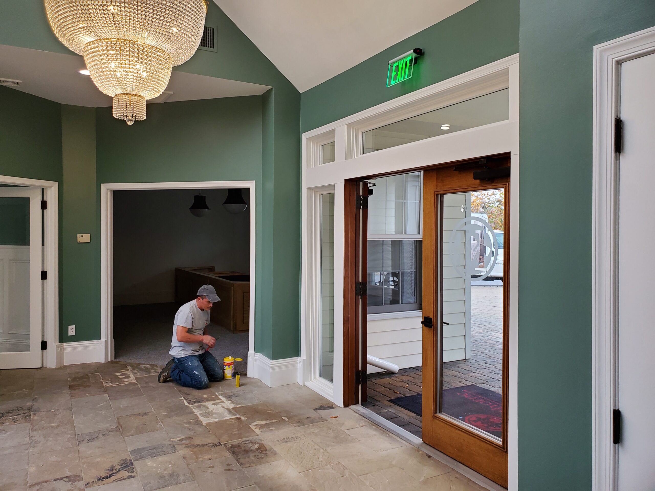
Green is another color tied to relaxation. Color therapists say that various shades of green create balance and harmony in a space. When thinking of forests and other natural landscapes, it begins to make sense. Green is known to lower blood pressure and soothe one’s nervous system. Because it can be an overwhelming color, we suggest trying out different shades and applying them to an accent wall.
Yellow stimulates the mind. Yellow is known to help with concentration, clear thinking and judgement. In general, yellow cleanses and purifies a space providing aid to one’s digestive system.

Courtesy of Australian Wild
White contains all the colors in the rainbow. It is a common color in commercial painting, but don’t undervalue it. Color therapists believe white illuminates our thoughts and give us clarity.

Courtesy of Life on Virginia Street
Red is a stimulating color. Red relates to strength, willpower and appetite. Color therapists use red to treat anemia, fatigue, low blood pressure and of course, poor appetite. When applying red to interior walls, make sure to use it sparingly. While it can certainly make a space feel cozy and warm, when overused, it has a claustrophobic effect.

Courtesy of Furniture Removal
Violet is another calming color, enhancing one’s purpose and dignity. Violet can make a perfect paint color for entry areas, offices or bedrooms, promoting a sense of purity and relaxation.

Courtesy of Unsizdk
Final Color Tips
Now that you have a general understanding of Color Therapy and how base colors affect a space, you can paint with a purpose. When picking colors, remember to assess the space in which you are painting. Is it meant to be active, relaxing or focused? Don’t be afraid to utilize contrasting colors; this will help those with poor eyesight to safely navigate a space. If you are fond of a specific color, consider playing around with multiple shades of that color in different areas of the room. We hope this helps you make your assisted living property a safe and stylish place for your tenants.
Don’t forget the exterior! We know the inside of your commercial property is looking stellar, but curbside appeal matters just as much.


