Taryn’s Tips: Color Harmony: A go-to theory when choosing paint colors.
“Will this look good together? Hmm, I’m not sure. I don’t want it to be too busy… Oh! What about this?” is mainly how I sound rummaging through the pillow section in a T.J Maxx (which happens on a regular basis) I see decorative nick-knacks and little colorful pieces of flare that I love, but always second guess myself on whether or not it will go with the design and colors I already have going on.
I decided I wanted to paint the walls of my bedroom yellow, so, what accent color should I choose to go with it?
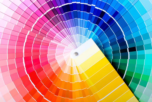
Harmony (n) is defined as “a pleasing combination or arrangement of different things.” One of these things is color, and it’s an important one. When choosing paint colors, you want to choose ones that make your space visually appealing… not too drab that the space evokes no emotion, and not too dramatic that it evokes too much emotion. Either can cause the brain to reject and want to look away from the unattractive spectacle you’ve created. However, when stumped on which colors to choose for your space, relying on some key color theories can be very helpful, and re:fab, a leading painting contractor in Massachusetts, has the tips.
Using the 12-part Color Wheel:
1. Analogous Colors: Analogous colors are any three colors side-by-side on the color wheel. For example: red, red-orange, orange: These colors together create a warm and inviting atmosphere, as you can see in this bedroom. Don’t tell me you don’t want to cuddle up in that cozy bed…
2. Complementary Colors: Complementary colors are any two colors that are directly across from each other on the color wheel. For example, blue and yellow: A classic combo, blue and yellow works great in any space, creating a crisp, clean look.
When you’ve chosen a color pallet you adore, your space will aim to engage and please. The professionals at re:fab are very knowledgeable and can make paint color suggestions if the client needs so. Trust them. They know what they’re talking about. Check back soon for more color harmony tips!