Pantone isn’t the only source of inspiration for colors to design your life around. See which colors Benjamin Moore & Sherwin Williams have declared as 2018’s Color of the Year and tips on how to incorporate these bold colors into your life.
Looking ahead to fun and relatively simple New Year’s projects, we’re thinking about updating interiors with bold, fresh paint colors. 2018 is the year of jewel tones. Read on to see how you can use the latest colors of the year from top paint brands.
Benjamin Moore’s 2018 Color of the Year:
Caliente AF-290

We love Benjamin Moore’s vibrant Caliente. Red is so easy to live with and is surprisingly versatile. It promotes creativity, energy and appetite, making it a good choice for dining areas, kitchens or any space where you work and create.
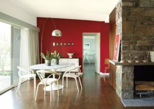

Use Caliente to place emphasis on an entire room or a feature wall. Red adds warmth to any space and is classic in libraries and media rooms. Lacquering a red room creates instant elegance and sophistication. Or, lacquer your bookcase to create a timeless sense of luxury. If you’re curious about how to achieve the look, consult your painting professional.

Nothing beats a red door.
Sherwin-Williams’s 2018 Color of the Year:
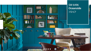
Oceanside SW 6496
Rich and evocative, Oceanside is a mysterious color that isn’t easy to pin down. Tones of green mingle with blue to create a youthful and complex paint with so many possibilities.
Courtesy of Sherwin-Williams

This versatile color can be used successfully in living rooms, dining rooms and bedrooms, as well as offices and powder rooms. Start with a feature wall if you’re unsure about painting an entire room.
Oceanside pairs beautifully with a range of styles, from European, to Middle Eastern or Asian. Accessorize with matte gold or bronze and bring in rustic wood furnishings for texture. Use this color in a boho-themed room with Moroccan accessories for modern flair.
Pantone’s 2018 Color of the Year:
Ultra Violet 18-3838
This statement-making royal purple symbolizes luxury, wealth, creativity and intelligence. Who doesn’t need more of those qualities? Ultra Violet is a show stopper, but its blue/gray undertones allow it to act as a neutral as well.

In the hallway above, Ultra Violet recedes into the background, while a chandelier, elegant furnishings and accessories set a tone of luxury and refinement.

The feature wall takes center stage in the bedroom above. Serene and peaceful, purples are good choices for bedrooms because they absorb light and create a cocooning effect. Ultra Violet would be successful in media rooms for similar reasons.
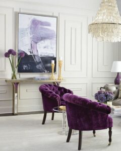

Purples have a playful side and they suit modern, creative personalities. In the photo above, Sherwin-Williams Concord Grape 6559 is paired with equally bold red and teal green to establish a serving area with a spirited vibe.
A royal purple front door signals stability, dignity and power. Purple blends well with nearly any house color, making it a good option for doors and shutters.
Think Inside the Bookcase
Each of the Colors of the Year look great in the settings above. If you’re looking for a new coat of paint in your home or office, either of these could do the trick!

Here’s a resolution you can stick to in 2018: Update your interior with a Color of the Year! Need help making this happen? Contact re:fab today!
About the Authors
_(1)2.png)
As West Coast transplants, Debbie Green and Snowy Eischen met by happenstance in their small Massachusetts town, and discovered they had a lot in common, including a vibrant family life, and a mutual love of creating beautiful homes and gardens. The seeds of their blog, New England Home and Garden: Family Life Through the Seasons were planted when they began attending antiques fairs, show houses, open gardens, and planning unique and creative parties for families in their village. They’re passionate about photography, styling, and home staging, all with New England flair!
